
Loud Community
Loud Community is the brainchild of Veronica Tolentino. She noticed a gap in support and representation for people of color who identify as female. Loud functions as a member-based league for women and non-binary folks, hosting workshops and providing educational resources. Committed to community-driven transformation, Loud aims to cultivate joy through friendship, self-development, and access to resources.
Check out the Loud Community Instagram for a fuller scope of meaningful work.
/ Branding
/ Art Direction
/ Web Design
/ Social Media Content
[2018 - today]

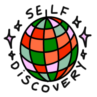
The Loud Logo is a hand drawn font, warped through the middle. We wanted something that symbolized disruption, connection, and fearless imperfection.
FONTS IN USE:
Kaneda
Temeraire
COLOR PALETTE:

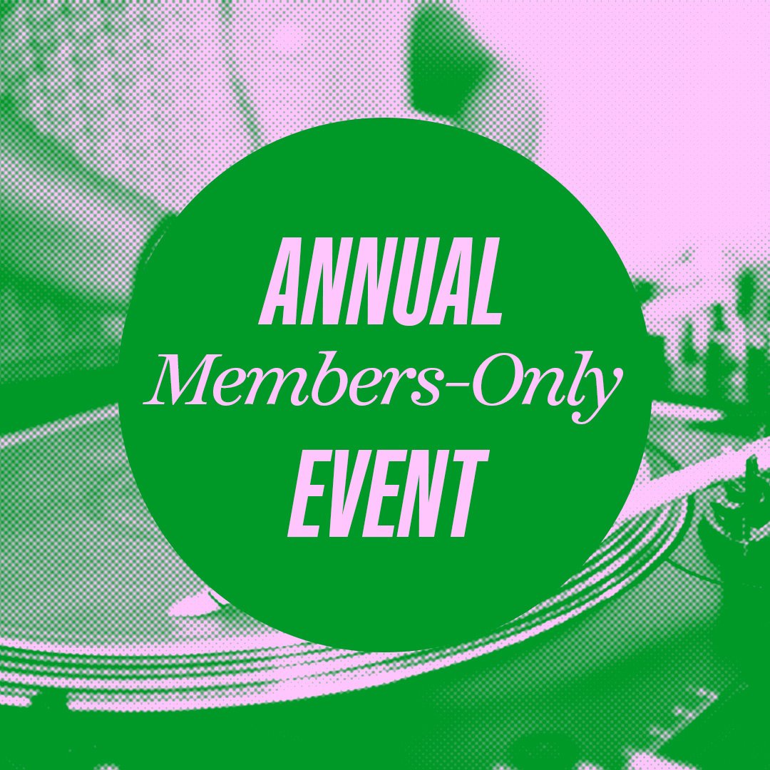
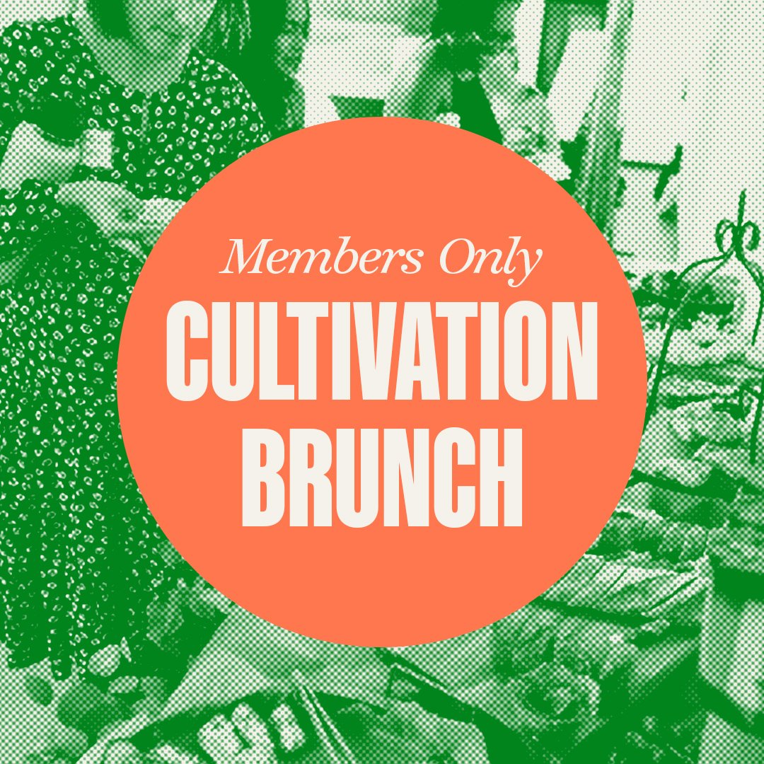
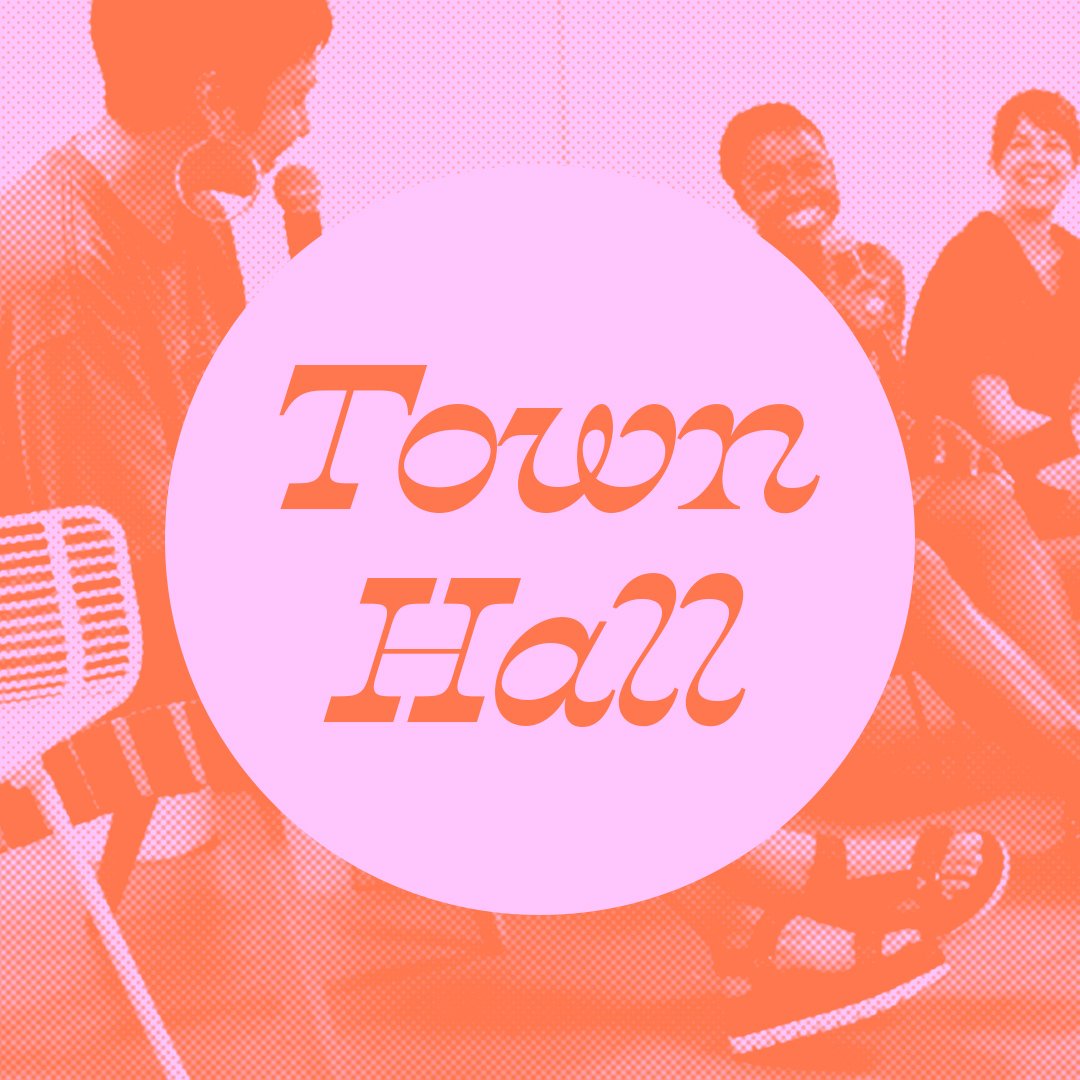
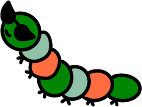
The website needed to be interactive for new users and community members. We didn't want just another obvious female-centric website. I created a gallery of fun graphics and characters to give the site personality. While acknowledging and being influenced by what's happening around us, we highlight our community in a unique way, making sure to have fun in our own style.

Loud Website Mini Tour


